Welcome to the Phil & Sebastian status quo brand standards.
This document defines the agreed use of the Phil & Sebastian brand as it exists today, providing a shared framework for applying the current identity consistently across all customer touchpoints. Its purpose is not to redefine the brand, but to create clarity and consistency for the current brand.
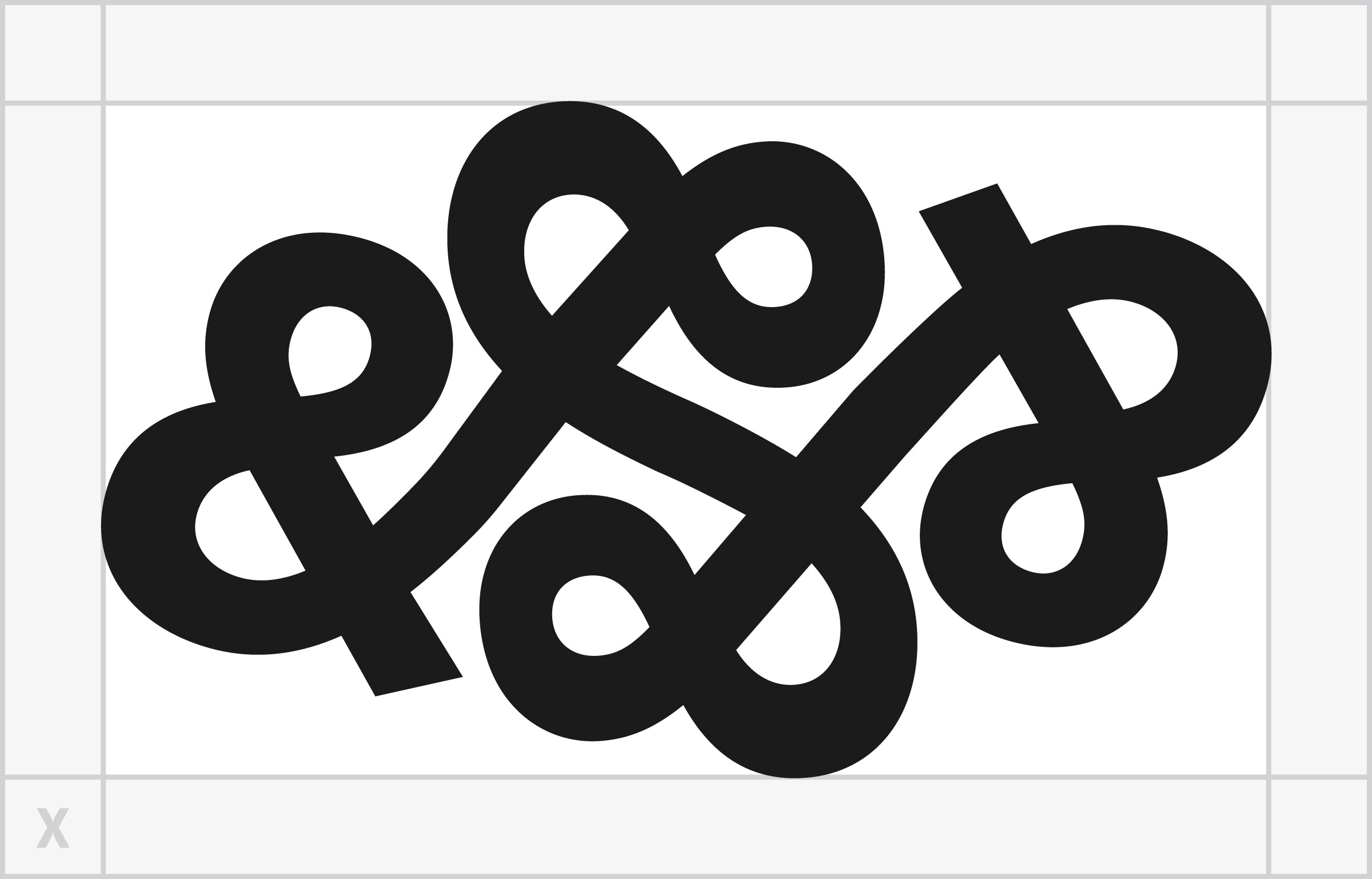
Symbol
The symbol is our strongest branding element and should be used most often. Always consider the audience and pair with the wordmark when needed.

Wordmark
The wordmark carries our name and with it, our legacy. Use it often alongside our symbol, especially when the audience may be unfamiliar with our brand.


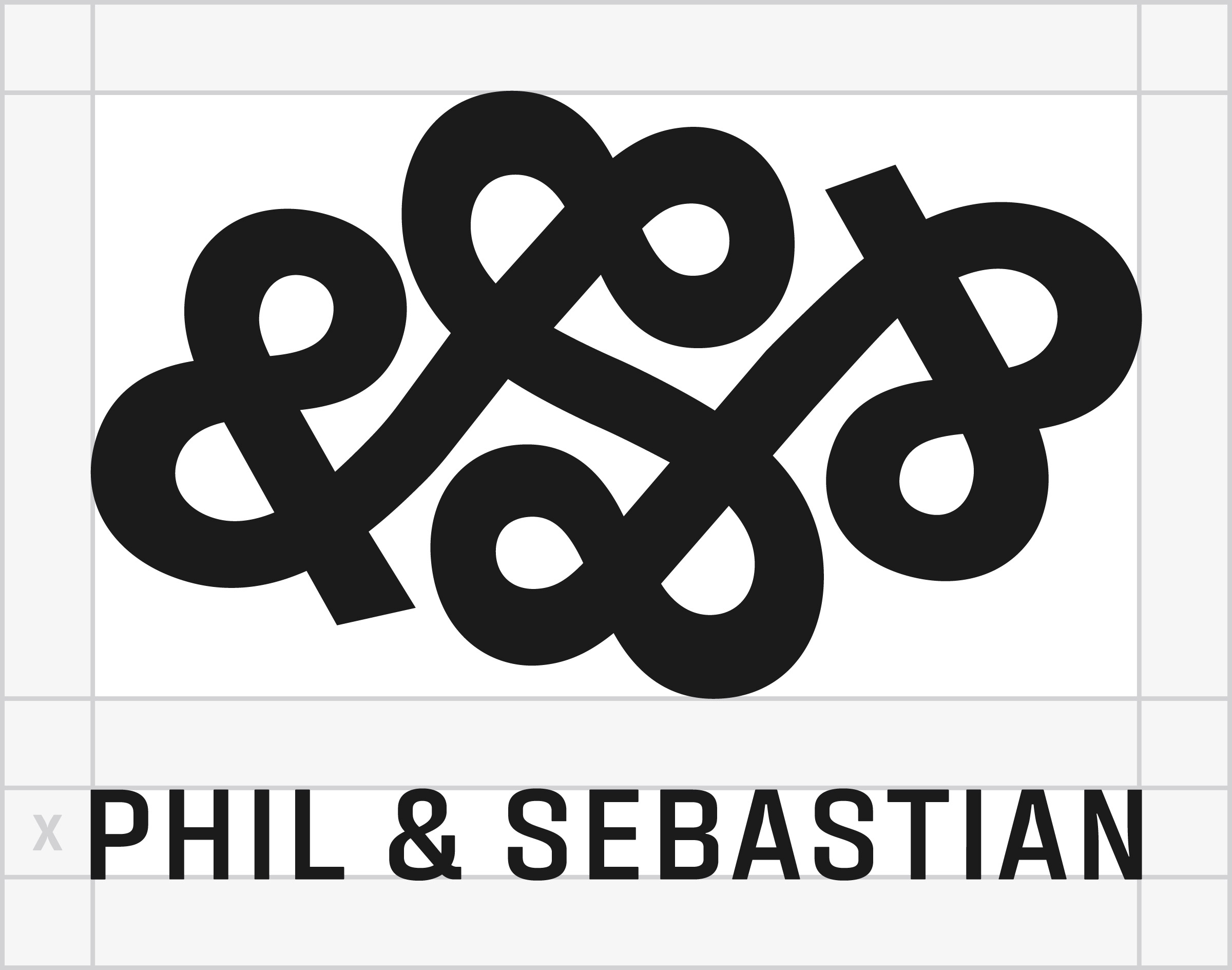
Logotype
The logo is our primary identifier. It contains both the symbol and our name. It should be used most often to represent our brand, especially to an unfamiliar audience.
Typography
Consistent use of typography is an important communication tool for our brand. Type weight helps differentiate between different pieces of information, create contrast, and establish hierarchy.
Fixture Bold Caps for key headlines & titles
Fixture SemiBold Caps for sub headings
Fixture Medium Sentence Case For Information Highlights
Fixture Condensed / SemiBold / Caps / Tasting Notes
Fixture Regular Medium SemiBold For General Copy and Information
Fixture is licensed from Sudtipos for Phil & Sebastian work only. Use it on Phil & Sebastian material, and do not pass the font files to anyone outside the company or use them on other projects. The download opens in Google Drive and needs a Phil & Sebastian sign-in.